Project
For a class during my time in grad school, we were tasked with designing a product focused on human factors and UX research. My peers and I decided to explore Arizona’s transport system as a domain. We researched, designed a 3D model, and ran a very quick usability test within 3 months. Given then short turn around, the goal for this project was to understand travelers’ pain points and design the most effective solution keeping human ergonomics in mind.
Problem
How might we design a kiosk to streamline the ticket purchasing process, improve discoverability and reduce wait times for passengers?
Outcome
We conducted interviews, heuristic evaluation and surveys to define the problem statement, followed by designing the UI and 3D model for the kiosk.
Client
Academic Project
Sector
Public transport
Role
UX Lead
Service
User research, 3D Design, Usability testing
Timeline
3 months
Tools
Figma
Blender
Google Survey
Google Analytics
Design Process
004
The users that participated in the survey, interview, task analysis, and usability testing were actual users selected on the basis of:
frequency of travel with Valley Metro
demographic factors such as age, language, disabilities (if, any)
experience using the kiosk

User Research
005
To validate the issue and define the problem statement, we interviewed 15 users and observed them using the kiosk. We also distributed surveys and conducted task analysis.
Where?
We interacted with people using the kiosk outside Tempe Transport Centre (TC). Because kiosks are placed only outside light rail stations and at the Tempe TC where all the Valley Metro vehicles end/ begin their trips.
Who?
We interacted people with diverse backgrounds, based on their frequency of travel, demographic factors, and experience with the kiosk.
What?
Different users had different pain points. On a high-level, there were some issues faced by majority of them:
Journey Mapping
006
From the research findings, we created 3 user personas and user stories. They were categorized broadly into:
regular passenger
new passenger
people with additional needs/ accommodation
Mapping the interaction of an average user, new and regular, this is how the map turned out:

Brainstorming
007
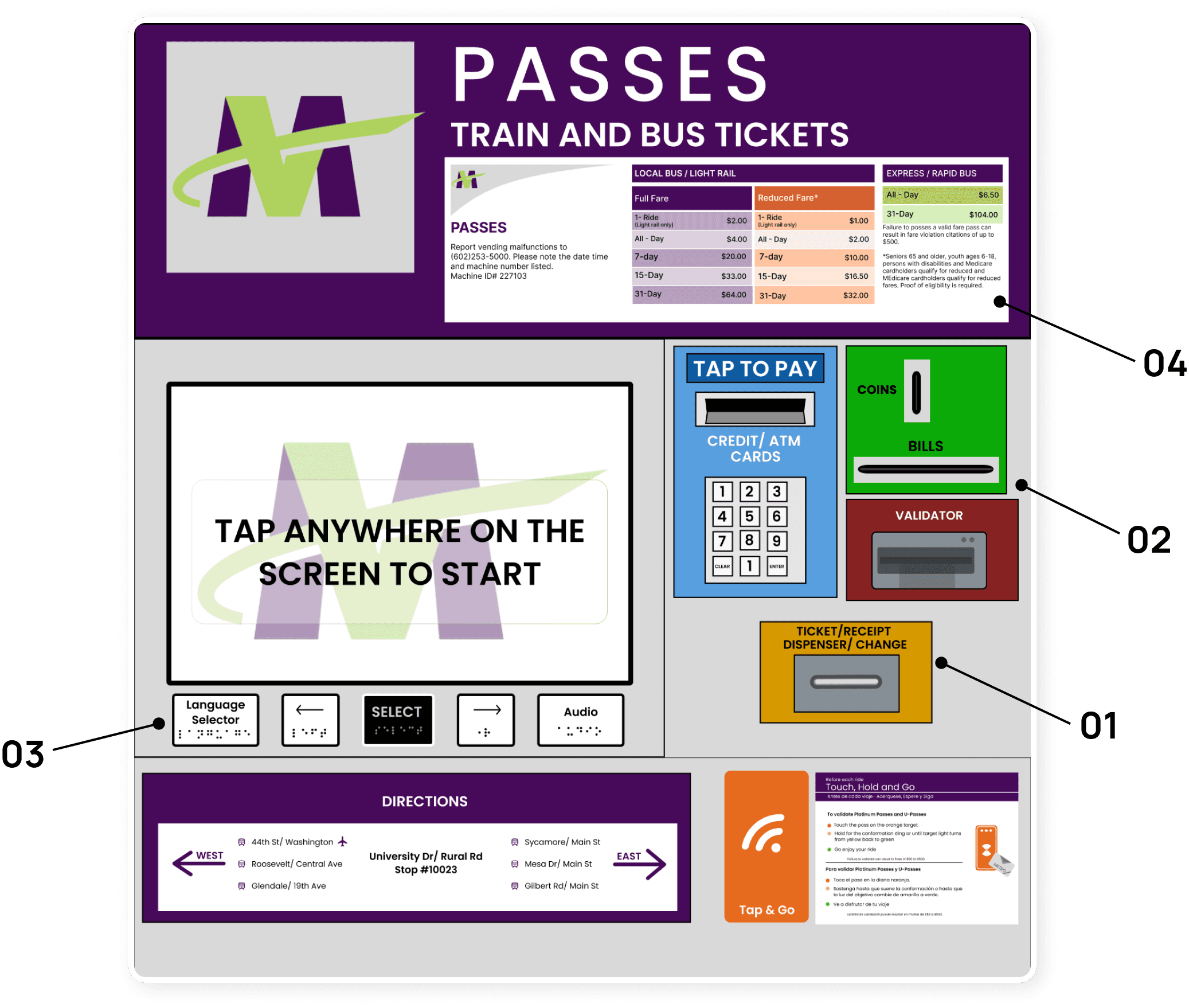
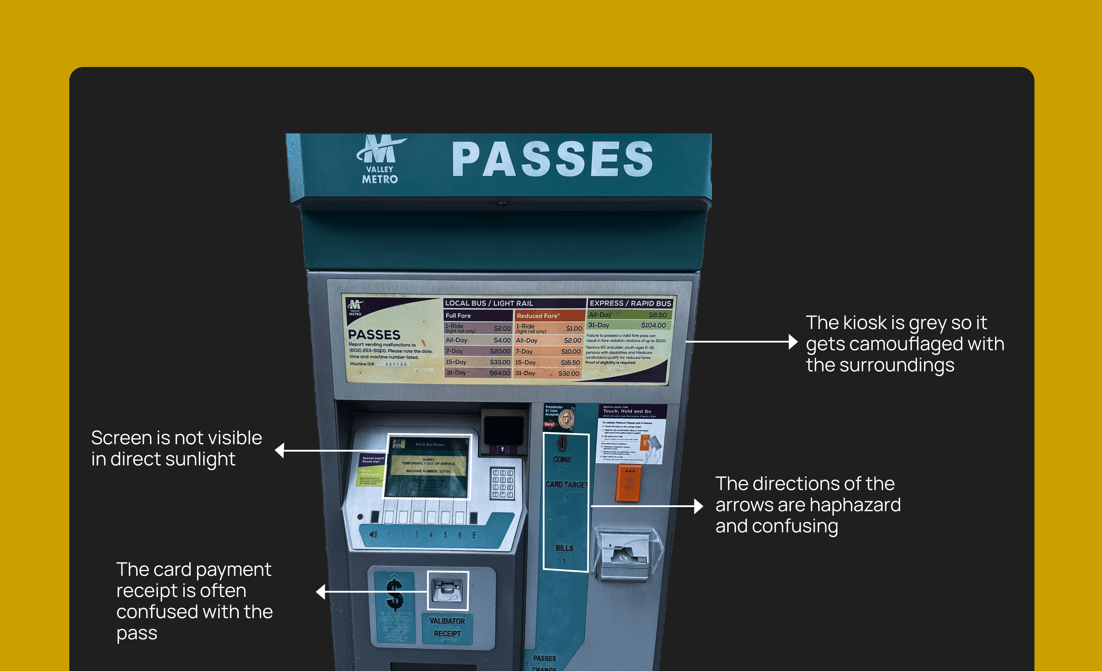
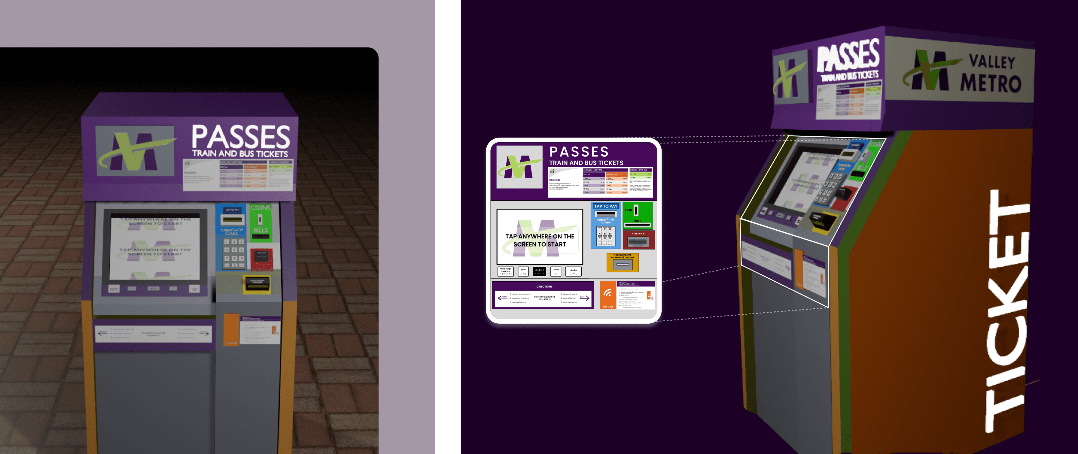
After discovering all the pain points, it was necessary to segregate the issues and work on them in iterations to solve each efficiently. Hence, we designed the UI screens and the physical body, minimizing cognitive load and ensuring accessibility for a diverse range.
01
Unintuitive Button Labels
Buttons numbered 1 to 6, "E" for language change, and a speaker icon for vision-impaired users were not understood by users, leading to them being ignored. This caused significant barriers for users with disabilities and non-English speakers, as the default language was English unless changed.
02
Hidden Pass Dispenser Slot
The pass dispenser slot is situated at the bottom, below eye level, with no visual cue when a pass is dispensed. This led users to mistakenly take card payment receipts instead of their travel passes.
03
Scattered Key Actions
Key actions such as coin and bill input, card tap for validation, etc., were placed randomly across the kiosk, adding mental load as users had to discover the locations of desired slots.
04
Confusing Arrows
Improperly-directed arrows below each slot added to user confusion and made navigation difficult.

Design System
009
At NYC DOF, I created our design system from scratch with the help of OTI and developers. I even outlined clear design usage through documentation for future use.
These elements not only modernized the visual design but also made strides in enriching the user experience through seamless interactions.
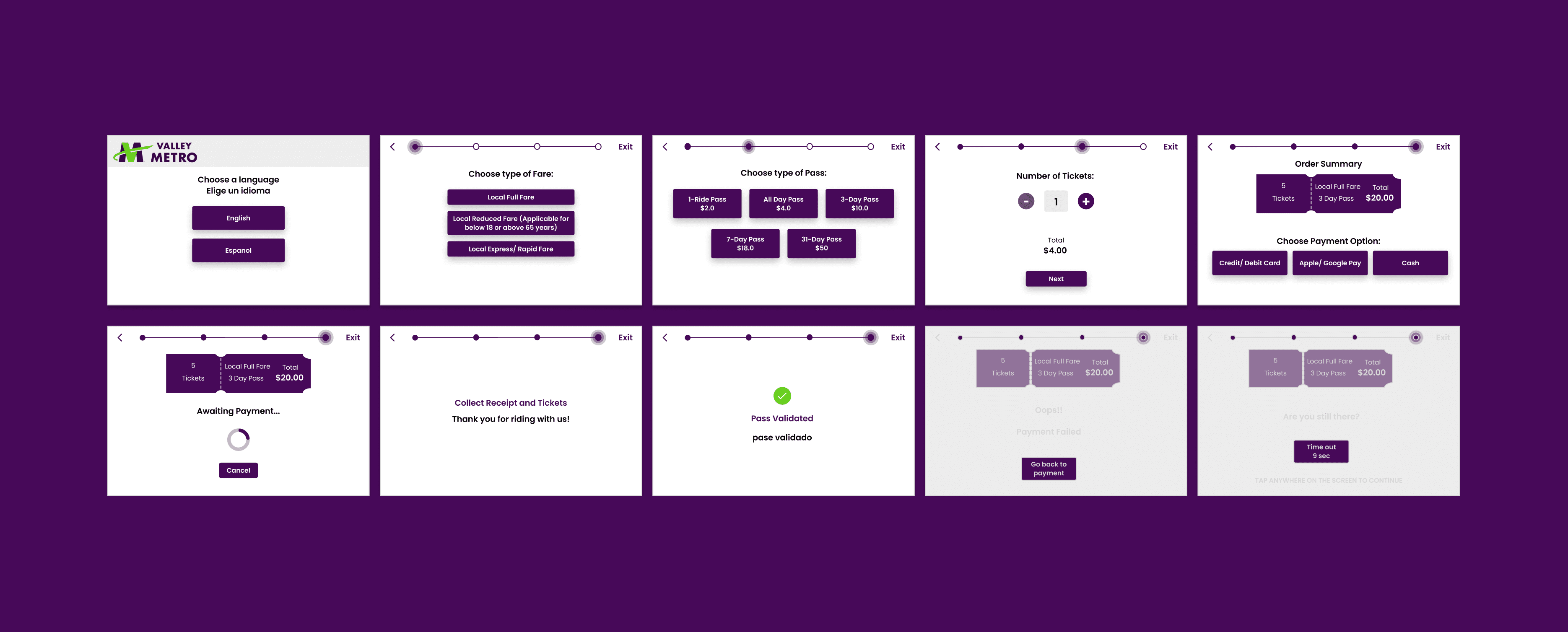
Issue
Lack of Error Recovery
Users struggled with entering all information correctly at once due to the absence of a back button for editing previously entered details.
Lack of Visual Hierarchy
The kiosk screen's lack of visual hierarchy made it difficult for users to prioritize information and navigate effectively.
Solution
Improved Navigational Flow
Redesigned the screen with a more intuitive navigational flow, allowing users to easily edit or cancel the process at any point.
Divided user actions into several pages, guiding users step-by-step from selecting a language, fare type, pass quantity, and more.
Implemented a proper visual hierarchy system for the screen interfaces.
Ensured that the selected colors and typography were consistent with Valley Metro’s brand identity.
Organized ticket options, fare details, and other relevant information into logical groups.
Emphasized the primary user action, ticket purchase, and differentiated information using typography and colors based on its importance to the users achieving their goal.
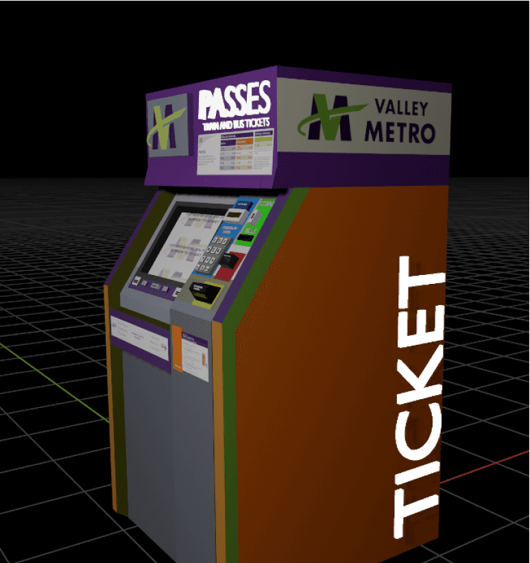
Physical Body Design
009
There were major accessibility issues in the physical product. It was grey which made it difficult to locate from a distance. Hence, we designed a 3D model that was easily usable and accessible.
User Experience
Task flow analysis enabled in identification of issues concerned with the kiosk’s UI. Users encountered cognitive difficulties due to complex navigation and unintuitive task flow.
01
Ticket Dispenser Slot
Moved the ticket dispenser slot to eye level for better visibility.
Introduced a blinking red light around the slot each time a pass is generated to improve discoverability.
02
Action Slots
Relocated all slots requiring user actions (coins, bills, card tap, etc.) to a single area beside the screen for easy access.
Grouped similar elements together and utilized space effectively.
Colors were used strategically to align with users' mental models. For example, the slot for bills and coins was colored green to resonate with money, and the ticket slot was made yellow to grab attention.
03
Navigational Buttons for UI Screen
Rebranded buttons as "Language Selector" and "Audio" for better comprehension.
Redesigned the user flow to include a language selection prompt at the beginning, offering English and Spanish options to cater to the majority population.
Braille and Audio buttons were added for better accessibility.
04
Instructional Labels
Designed clear and concise information labels to display crucial details like eligibility criteria for a reduced fare, direction details, and pass validation instructions.
Content design for instructional labels focused on helping passengers in haste to quickly comprehend the relevant information.