Project
The NYC Department of Finance (DOF) has identified its outdated website as a high-priority project due to usability issues and inconsistent data. They hired an external vendor to conduct user research, and I was one of the two UX design interns brought on board to lead the website redesign.
As the sole designers at DOF, our mission was to craft a cutting-edge and user-centric website design that meets the diverse needs of the city's vast population.
Problem
How might I redesign the decades-old website of 550+ pages to ensure accessibility, simplicity, and legal obligations?
Outcome
We created a design system, and information architecture and designed prototypes using data-heavy user research.
Company
NYC Department of Finance
Sector
B2C, Legal, Finance
Role
UI/UX Design Intern
Service
Design System, UX Prototype
Timeline
3 months
Tools
Figma
Airtable
View Live Site

Design Brief
004
From conception to collaboration
This is one of the most challenging projects owing to its massive scale and the diverse needs it was supposed to cater to. I worked with many professionals to achieve the end results:
01
Product Manager
To understand the scope of the project and its requirements. Also, to build a sitemap and manage the massive number of webpages.
02
Engineers
To understand the technical constraints because the site was being developed on an existing framework. Also, to make sure final product matched the design exactly.
03
Content Strategist
To rewrite the important content and to remove some outdated one. Also, to ensure important information is clearly displayed without any legal violations.
04
Primary Stakeholders
Since it is a high priority project, agency leaders including the Commissioner and Director of Department of Finance are directly involved in the project.
05
Office of Technology & Innovation (OTI)
It is a government agency that manages the city’s digital strategy and design guidelines for all the government websites for the city.
User Research
005
Project constraints
This ambitious project came with technical and content constraints.

Overriding legacy code
The complexity of overwriting existing code on a city website is magnified by their massive size. Throughout the design process, we made meticulous decisions, mindful of the legal and ethical implications.

Digital & legal regulations
Adhering to government regulations, mandatory elements were needed to be strategically incorporated into the design.

Strict design guide
All the city websites need to follow a certain design guidelines which are set by OTI. It is important that city websites are consistent in design so its easier for residents to use these services intuitively.
User Research
006
Analyzing Research Data
The product manager provided me with the extensive UX research that was gathered over the span of last 6 months. I went through the data to answer following questions.

Project Management
007
Keeping track of 550+ pages
Managing a project of this scale is quite challenging. There was so much ambiguity over the content that needed to be added.
We categorized the pages into “new design” and “overhaul” to enable a priority list of all the pages that were to be built from scratch.
800+
Old Pages
I worked with my manager to collect the site analytics and divide the pages to be reviewed. After a lot of discussions, we were able to cut down around 250 pages, based on incorrect links, irrelevant data, and outdated CMS pages.
80
Hours
Given the tight deadline, we used Airtable as a software management system to add all the existing pages in its correct position in the hierarchy.

Project tracker: to manage the site pages
Information Architecture
008
Building Information Architecture
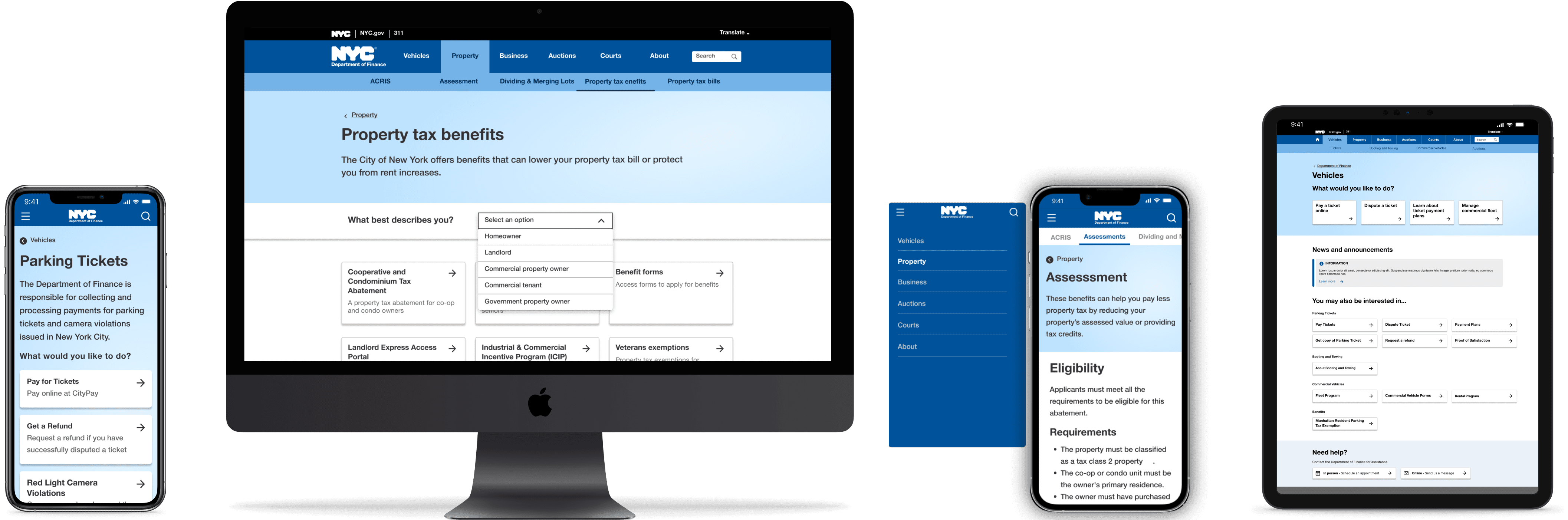
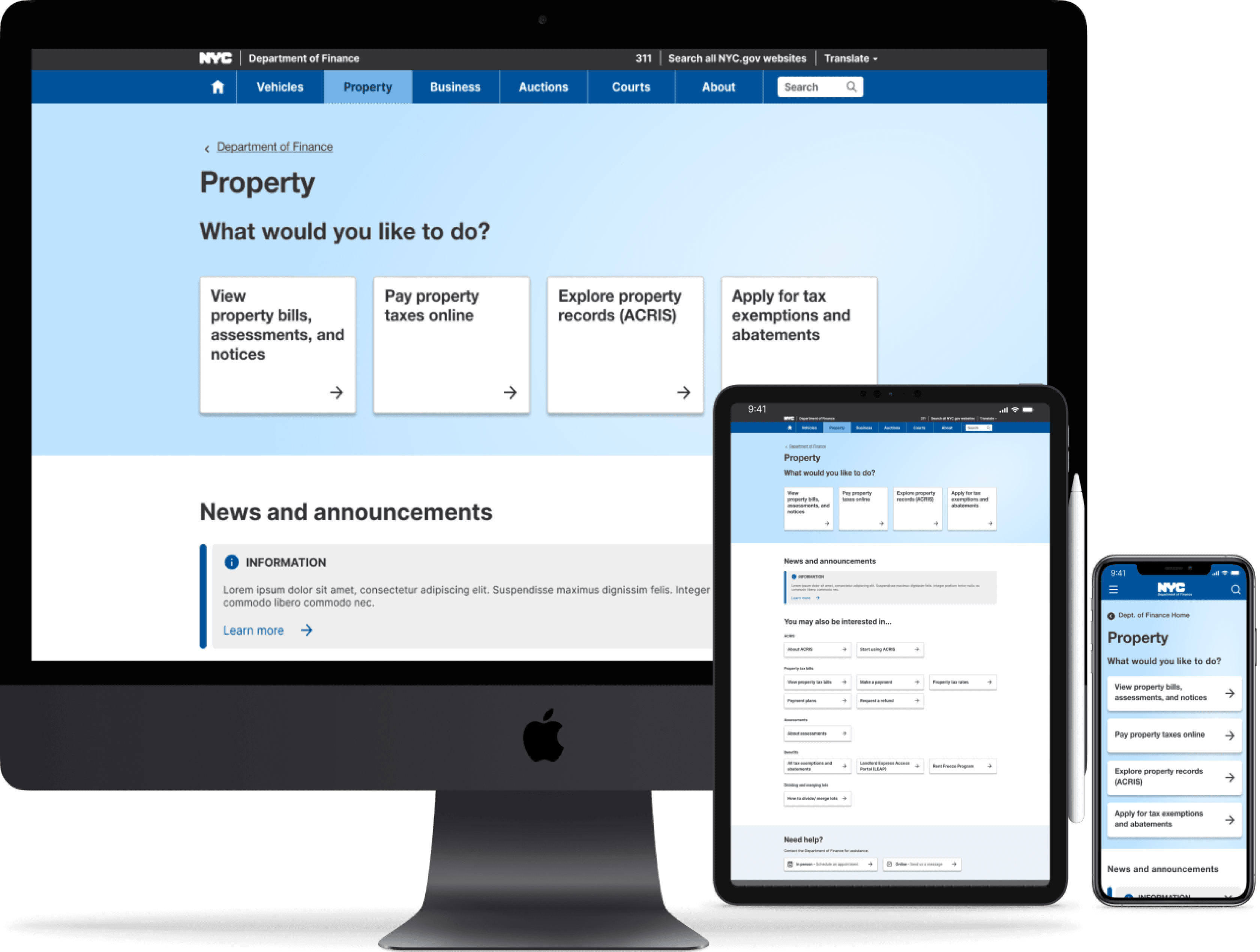
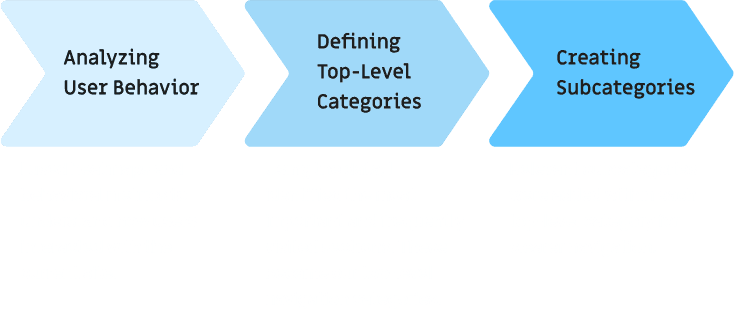
The previous sitemap had a single level of navigation, making it difficult for users to predict where to find the content they needed. This often resulted in confusion and frustration, as users had to click through multiple pages to locate the desired information.
I developed a two-level navigational hierarchy aimed at enhancing intuitiveness and reducing the number of clicks required to complete tasks.

Design System
009
Building a robust design system
At NYC DOF, I created our design system from scratch with the help of OTI and developers. I even outlined clear design usage through documentation for future use.
These elements not only modernized the visual design but also made strides in enriching the user experience through seamless interactions.
Say hi to learn more!

Problem Solving
010
Design & Iteration
We designed with a mobile-first approach. This was one of the most challenging pages to create due to responsive screen constraints. The Contact Us page was iterated several times over 2 months.
01
Problem
Given that the government of New York is one of the busiest organizations, the "Contact Us" page was overwhelmed with an excessive number of links due to the multitude of departments and issues handled by the organization. This made it nearly impossible for users to find the desired information efficiently especially on mobile screens, resulting in infinite scrolling.
02
Solution
After evaluating various iterations, I created a prototype that caters to all and adds visual hierarchy. The final design includes a predictive search feature to enhance user autonomy when searching for links. This combination of search and drop-down menus improves readability and provides an intuitive and efficient user experience.

Impact
011
Quantitative impact & metrics
The Commissioner of New York City launched the new design in December 2023. The post-launch metrics proved it to be a huge success.
8.3+ M
users in the first quarter of 2024
increase in avg. time spent/ session
decrease in drop rate
The Fun Stuff
012
Working in NYC was a dream come true
As cliche as it sounds, the summer was straight out of dreams. Not only did I get to work on the coolest project with the commissioner of the city but also made an impact and had fun doing it.
It was my big-girl moment (Taylor's version!)